Based on the data visualization options presented above, we now concentrate on the interaction of parallel activities and possible bottlenecks. At this point, the user is interested in seeing a sequence of activities on all nodes, and the interdependences between these different program parts.
The problem with most other visualization tools like Paragraph [Int93] or Pablo [Ree92] is that these tools are based on the Replay Technique: Whenever the user wants to have just another information about a special part of the program, the whole trace file is analyzed once again, even if the file contains several hundreds of Mbytes (see Fig. 6). The magnification glass has to scan the whole trace file several times whenever the user would like to see a different information or just another time frame.
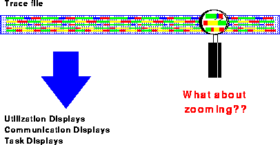
Figure 6: Zooming and the Replay Technique
This is different in the VAMPIR-environment: here, the user can specify the size of the magnification glass, and all details within the magnification glass can be seen without any further I/O-activity (Fig. 7). For example, statistics for all activities inside the chosen time window can be generated within milliseconds. Moreover, the user can use a powerful zooming feature to analyze the program behavior on any level of detail; each zoom-operation also takes only a few milliseconds, even if several Mbytes of tracing information are under investigation. Of course, a hierarchical unzoom-operation is provided for user convenience.
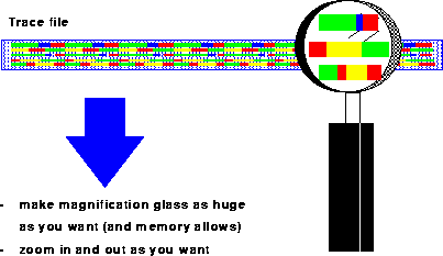
Figure 7: VAMPIR realization: Make zooming as easy as possible
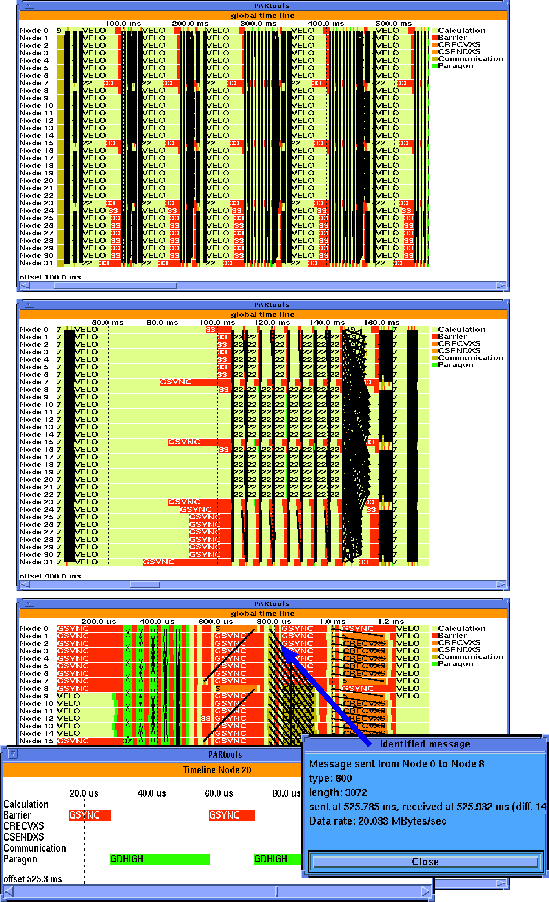
Figure 8: Time-line zooming and message identification
In VAMPIR, the Global_Display/Timeline panel is used to display this type of information. As can be seen from the upper part of Fig. 8, colors are used to represent different kinds of activities, and it is possible to show system activities over time on each of the nodes. In this example, the program is running in phases where the subroutine VELO is executed several times. The black parts are hundreds of messages (represented by one line each) which are sent between the nodes. Based on the information displayed in this window, it is quite easy to identify critical program sections where problems may have occurred.
The zooming feature can now be used to go into detail. As
shown in the middle part of Fig. 8,
the period of interest![]() (400 --
560 ms) was zoomed-in by just specifying the time frame with the mouse.
Here, one of the time-step iterations can be seen, and the load
imbalance causes long synchronization times at the barrier called
GSYNC.
(400 --
560 ms) was zoomed-in by just specifying the time frame with the mouse.
Here, one of the time-step iterations can be seen, and the load
imbalance causes long synchronization times at the barrier called
GSYNC.
The zooming feature also can be used to get deeper and deeper into the analysis process, to understand program behavior, and finally to identify problems. The lower part of Fig. 8 shows a data communication exchange part of the program (at about 525 ms) where different communication patterns inform the user about his communication activities. In the message passing programming model, communication and data exchange are solely based upon the sending and receiving of messages. Regardless of the network's topology (which is hidden to the application programmer in most cases), it is obvious that the visualization of message transfers and patterns plays an important role in the performance analysis and debugging of parallel programs. Therefore, VAMPIR includes means to display and inquire information about message-passing transfers. These tools are not isolated from the other part of VAMPIR: message events are read through the same trace file interface into VAMPIR, and the message visualization tools work hand-in-hand with the features described so far. It is possible to mouse-click a message that pops up another panel showing all information related to that message, including the transfer rate in MByte/s (i.e. about 20 MByte/s). The information for this message is coming out of the wrapper of the MPI_SEND/MPI_RECV communication routine, and the overhead involved is quite low.
Moreover, detailed information about the activities on one node or a selection of nodes can be obtained. The lower left part of Fig. 8 documents that even calls to gdhigh (a few microseconds inside the communication library routine) easily can be identified. A case study on Intel Paragon [WiNa94] describes a situation where the VAMPIR environment was extremely helpful in identifying performance bottlenecks in the communication library; based on the optimization process, the output performance (hippi-output) was increased by a factor of more than five within a few hours.
In addition, the zooming operation can be used to identify typical communication patterns. It is obvious that the visualization of such communication patterns gives knowledge about implementation aspects of the system and of your own program, and it is very helpful to understand synchronization delays and related side effects which sometimes significantly influence the performance of real applications.
For example, Fig. 9 shows a zoom-up of a program that uses MPI calls for a reduction and a broadcast operation (some of the 64 processors have been filtered for a clearer display). One can easily see the communication patterns the MPI libary uses internally for a broadcast. Moreover, by clicking at a message, one can identify the communication IDs and types which the MPI implementation uses internally. The ability to look into the implementation in this way is a key feature to understand why programs that use a standardized message-passing library like MPI behave differently on different machines.
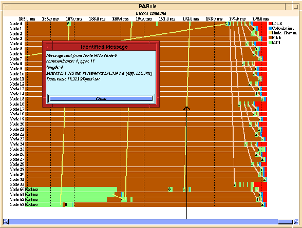
Figure 9: Identification of MPI messages
To clarify the display, VAMPIR allows to assign different colors to messages of a specific type or communicator range. Alternatively, messages of certain type or communicator ID can be removed completely from the display if only a certain subset of messages is of interest. The length of messages can be visualized by a different line width for shorter and longer messages.
To evaluate the overall message traffic that took place over a period of time, a matrix of communication can be opened (Fig. 10) that shows different statistic values for the messages that were passed between each pair of sender and receiver. Specifically, the following parameters can be shown:
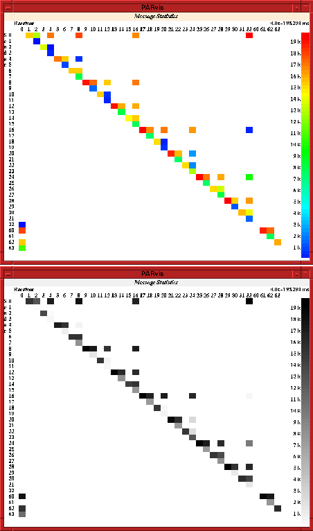
Figure 10: Statistics of the message passing communication rate
 The total number of messages passed between the processors
The total number of bytes passed between the processors
The maximum, minimum and average length of messages
The maximum, minimum and average data rate that was reached
This display simplifies the detection of unbalanced communication and performance reductions because of too many short messages, what usually results in a low average data rate.