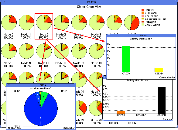
Figure 4: Time distribution statistics for the program run
The Node display mode already contains a small statistics field, but due to its limited size only the time portion of one state can be monitored. Quite often, one would like to get a more detailed idea of how the time is spent on each of the nodes. To analyze the complete state distribution, it is possible to switch the display mode to the statistics display. Press F6 or select the menu option Global_Display/Chart Style, and another window will come up (Fig. 4), which shows a statistics of the complete trace file in a pie chart style. The colors chosen for the individual states are just the same as those which are used as the background color for the state field in the CPU display. The most important activities can be identified for all nodes, and differences in the node behavior will be clear immediately. As can be seen from that panel, most time is spent in Calculation on all nodes, and significant portions of time are also spent at a barrier.

Figure 4: Time distribution statistics for the program run
When a lot of CPUs are involved in a parallel system, the individual
statistics in this display can become very small and uninformative. To
relieve this unfortunate situation, VAMPIR can open additional windows
containing statistics for only one CPU. To select the CPUs you
want statistics for, simply click at them with the left mouse button,
and their frame color will be inverted. You can also drag over a
couple of CPUs to select several CPUs with one action. In the example
shown in Fig. 4, the actual time distribution spent in
user subroutines (Calculation, pie chart in the left sub-window:
most time is spent in subroutine VELO) as well as for node
communication (Communication, histogram in the upper right
sub-window), and Paragon emulation (Paragon, histogram in the
lower right sub-window) is shown for node 2. The user can toggle
between table, pie chart, and histogram in all chart windows. The
histograms may be linear or logarithmic, and zooming is supported.